Case study · Concept build
Marigold Coffee
A neighborhood café website that feels like walking in: warm, bright and a little playful — and built so someone searching on their phone can find the menu, the hours and the door in seconds.
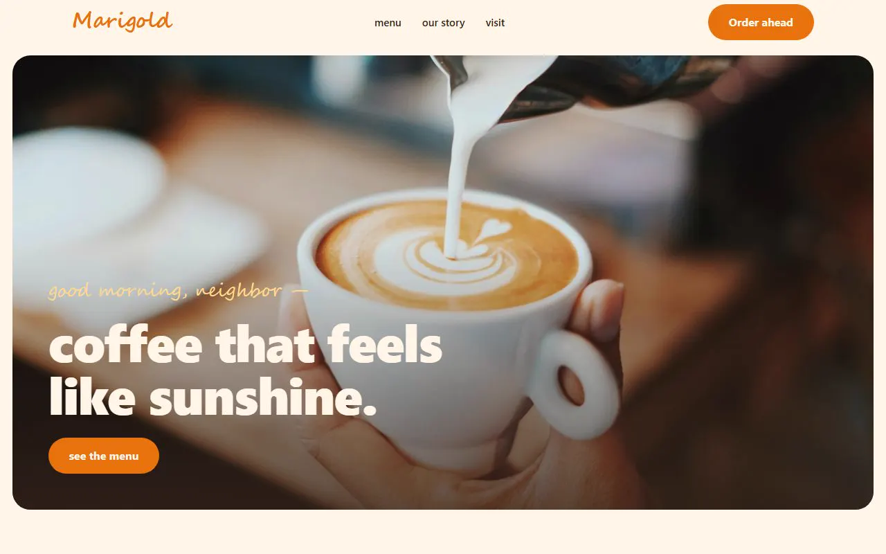
Most people find a café the same way: a quick search on their phone, often while already walking. They want three things — what’s on the menu, whether it’s open, and how to get there — and they want them immediately.
The approach
- Personality first. A handwritten-style script, sunny orange and warm cream: it should feel like the café before you ever walk in.
- Menu up front. The “regulars’ picks” sit right under the hero, with prices, so nobody has to dig for them.
- Visit details in one card. Address, hours and a directions button in a single, thumb-friendly block.
- Small delights. Cards that tilt slightly on hover, a wavy section edge, latte art in the hero. Little touches that make it memorable.
What it shows for your business
The same thinking works for any walk-in business: answer the urgent questions first, make the next step obvious, and let the personality of the place come through. A site like this is a new site from scratch on our price list.

Free, no-pressure look
Let’s fix your website.
Send us your website address (or your business name, if you don’t have one yet). We’ll take an honest look and tell you what we’d do — and what it would cost.